Dracula
by Bram Stoker
Illustrated by James Pyman
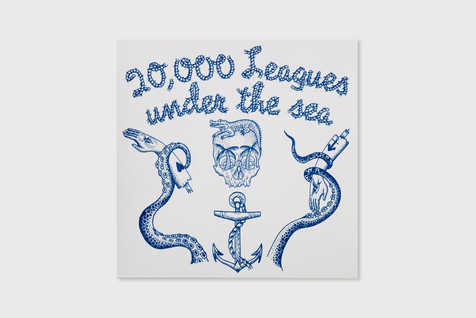
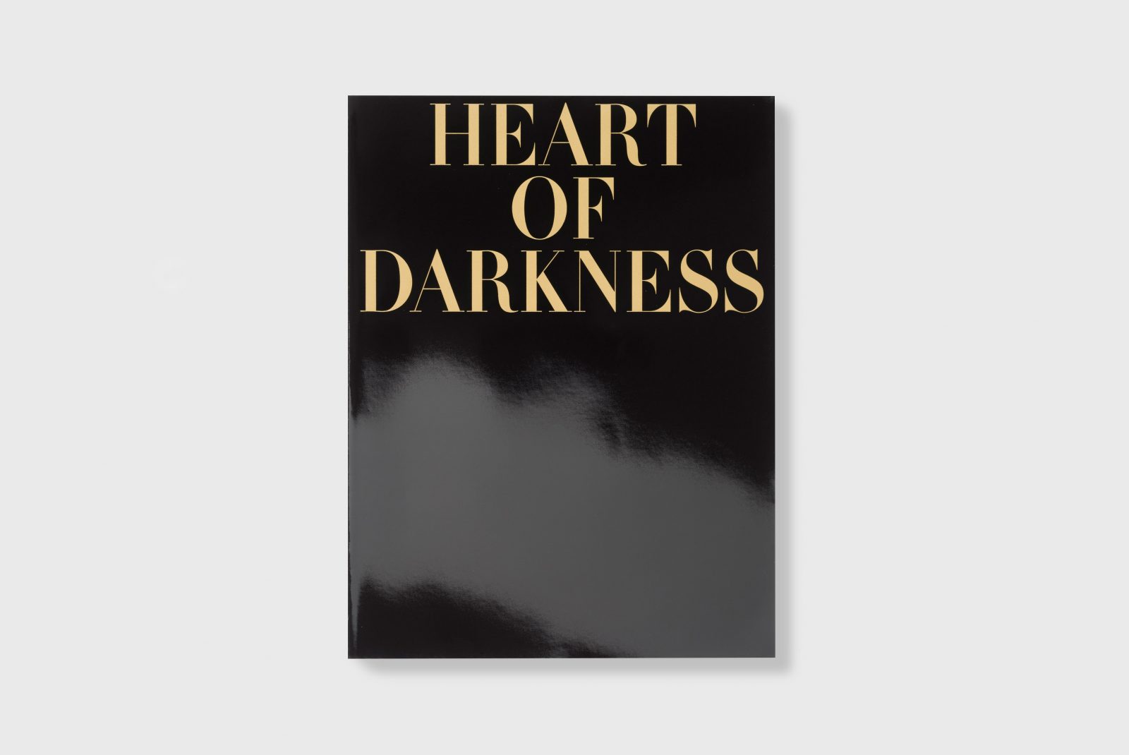
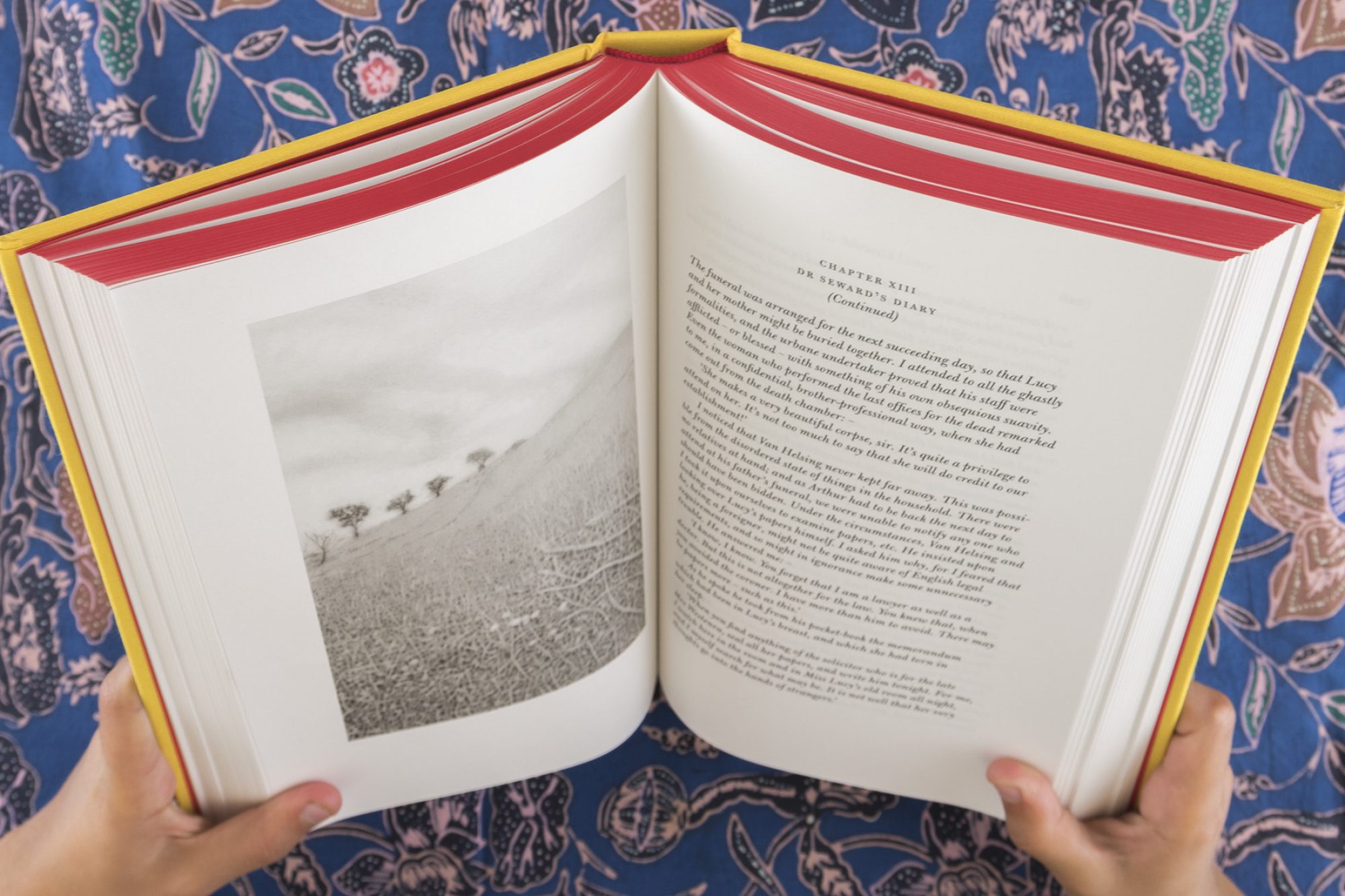
This most famous of vampire stories is revived through a series of beautiful pencil drawings by illustrator James Pyman. For this new edition of Dracula, designer John Morgan worked in collaboration with the artist, who sketched a line or phase from each of the book’s 27 chapters.
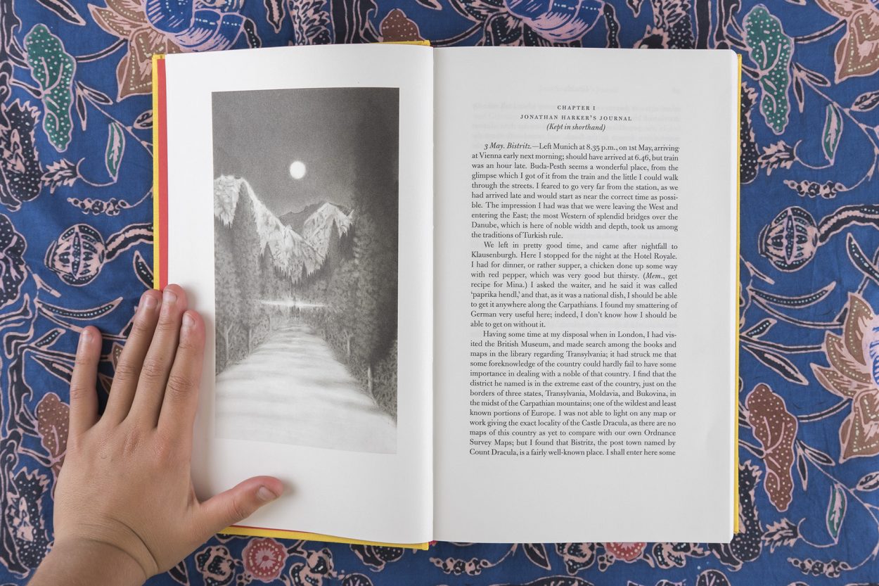
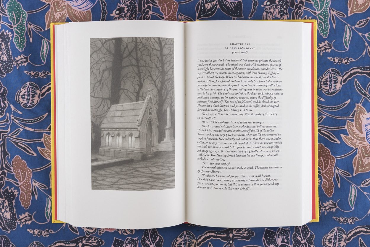
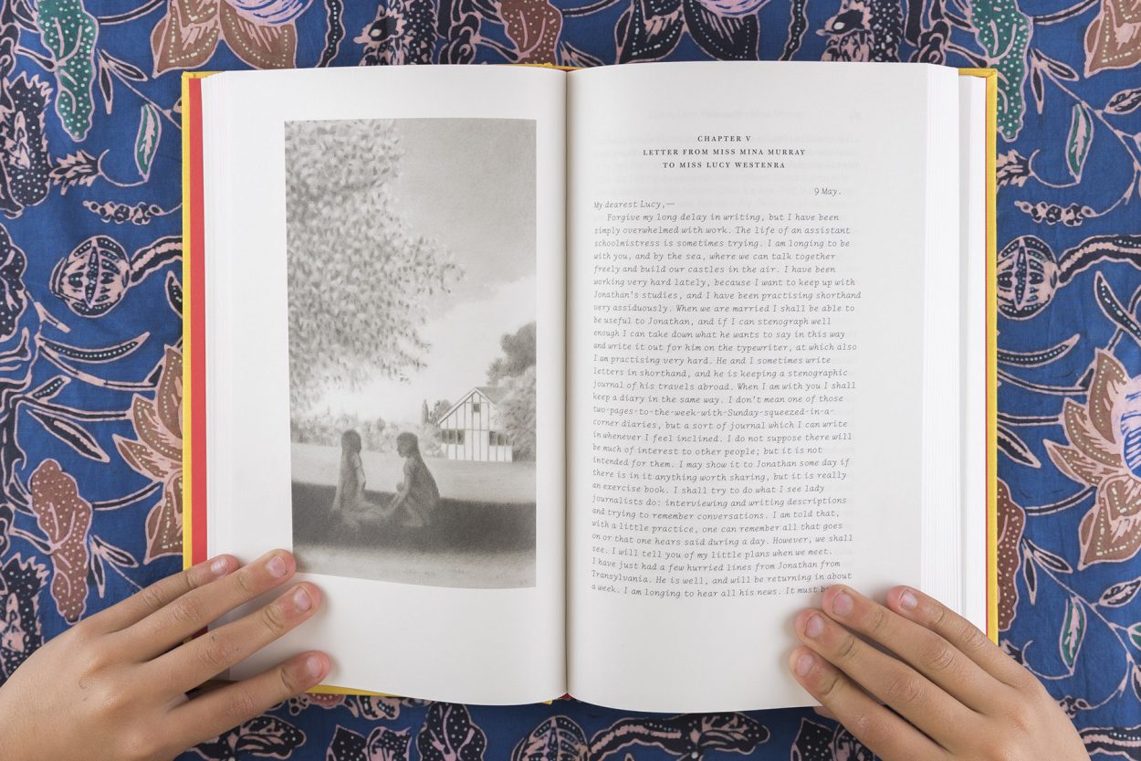

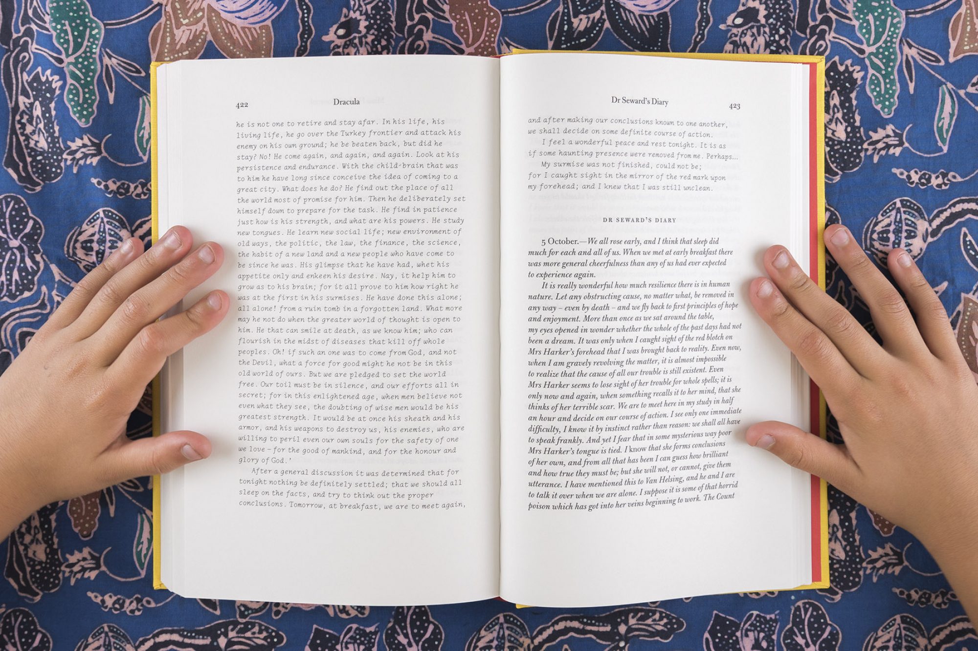
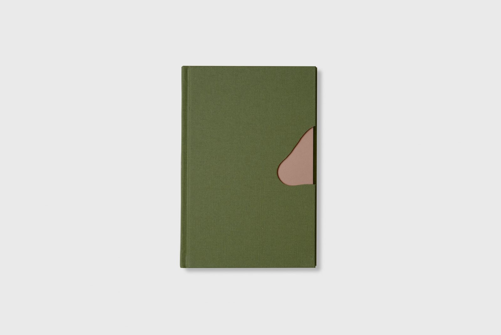
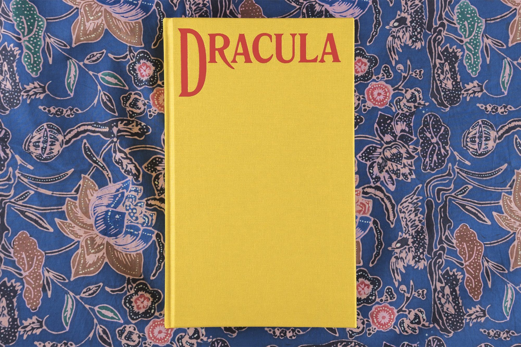
This second book in our Familiars series is made up of a series of diaries, letters and newspaper cuttings, has been typeset by Morgan with a different typeface for each character, the fonts based on those in use at the time of the book's original publication. The yellow clothbound cover echoes that of the first UK edition.
The typefaces used in this edition are:
LTC Remington Typewriter Pro Italic, for Mina Harker’s journal
Bulmer (justified), for Jonathan Harker’s journal
Bulmer Italic (ranged left), for Dr Seward
Akzidenz Grotesk, for Dr Van Helsing (Akzidenz Grotesk is the forefather of Helvetica and was released one year before Dracula was first published)
Goudy Sans Italic, for Lucy Westenra’s letters
Orator Standard, for telegrams (this typeface is matched exactly to a telegram of that period)
Century Expanded, for newspaper extracts
Greenwood, for Sister Agatha
Dracula
by Bram Stoker
Illustrated by James Pyman
Hardback, 496 pages, 24 × 14.8 cm
Four Corners Familiar #2
Designed by John Morgan
Published November 2008
ISBN: 978-0-9545025-7-7
£20


