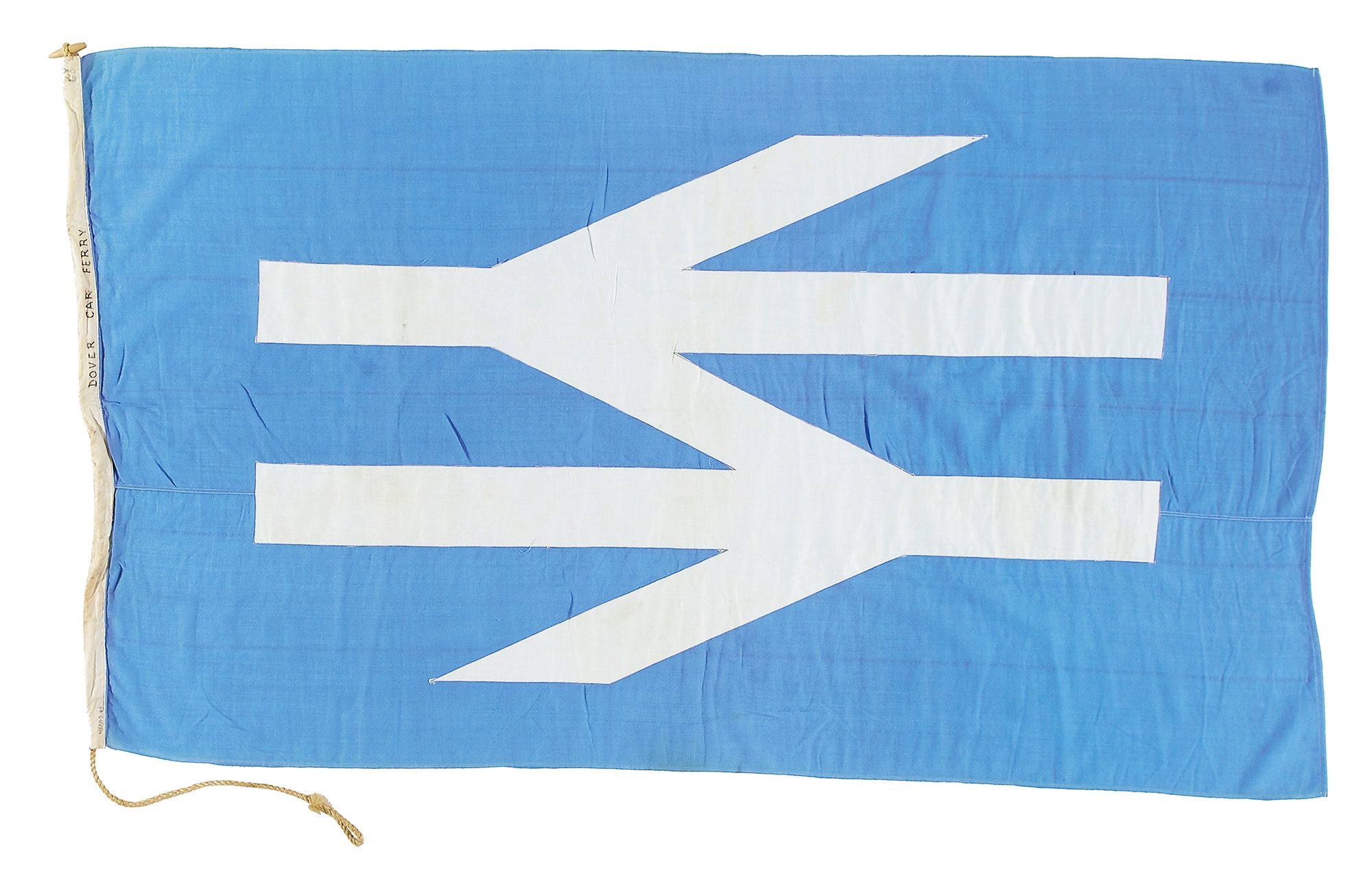
Sealink is British Rail’s forgotten Shipping Division. Sealink passenger, car and train ferries linked this island with Europe, Northern Ireland, Éire, and Scandinavia. The ship interiors were designed by practices working for city boutiques and international airlines, modelled as suave cafeterias and opulent, if somewhat plastic, lounges. Travellers on open decks speculated on the possibilities of the horizon in spaces of steel maritime architecture above a ponderous churn across the English Channel or Irish Sea, and below the ripple of a wool and synthetic fibre bunting flag displaying the Sealink brand of white double arrow on blue ground.

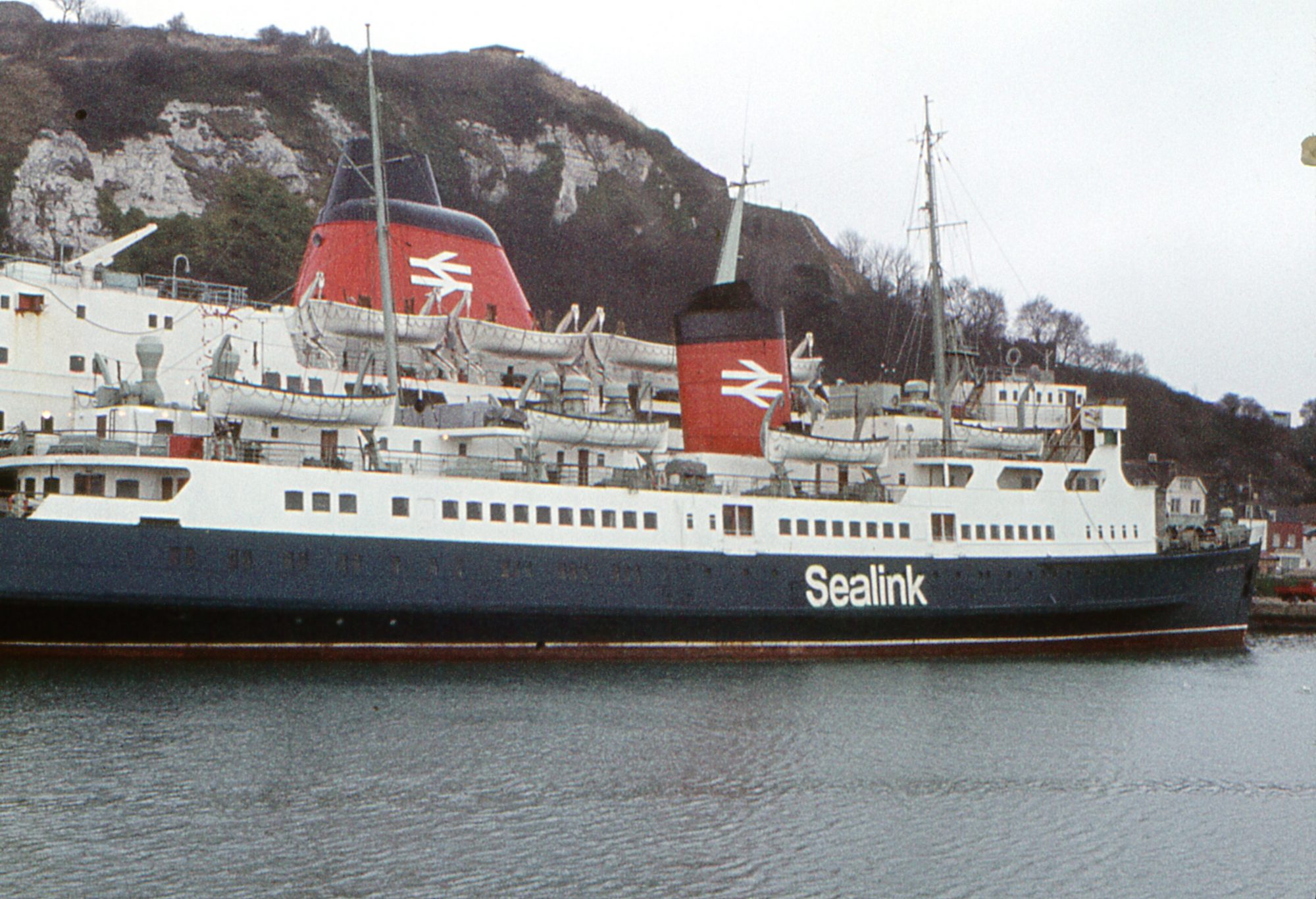
Sealink ferries Horsa and Maid of Orleans, Dover, 1973. Photo: Barry Lewis (CC BY 2.0)
Before the Channel Tunnel and cheap air flights, sea ferries were essential for commerce and leisure. In 1973, when its success was a rising tide, Sealink carried 7.5 million passengers and 1.1 million cars in 64 ships between 26 ports, working in partnership with Belgian, Dutch, French and Irish agencies. Sealink carried whole trains over the water in special vessels, providing the luxury of night sleeper services; it promoted the environmentally wise option of freight transport by rail and sea. And all under a blue and white flag.
Let’s get the flag colour out of the way first. The multi-disciplinary agency Design Research Unit created a new corporate identity – or brand – for British Rail, introduced in 1965. In keeping with European design trends originating in Switzerland and Germany, the new face of British Rail would be rendered in black, white and red. Without exception. Design Research Unit also admired the muddy hues of mid-1950s colour palettes; travelling in Europe their researchers saw a deep blue-green which looked good outdoors in many climates and environments. Paint manufacturer ICI called this ‘Monastral Blue’. Design Research Unit called it ‘Rail Blue’. So, British Rail trains would be blue. Such was the uniformity of this state-sponsored re-brand, Rail Blue was also applied to the Sealink ships, complementing their red funnels. If red represented rail in advertising and publicity branding, then blue would speak for sea, and the Sealink flag would be a version of ‘Monastral Blue’.

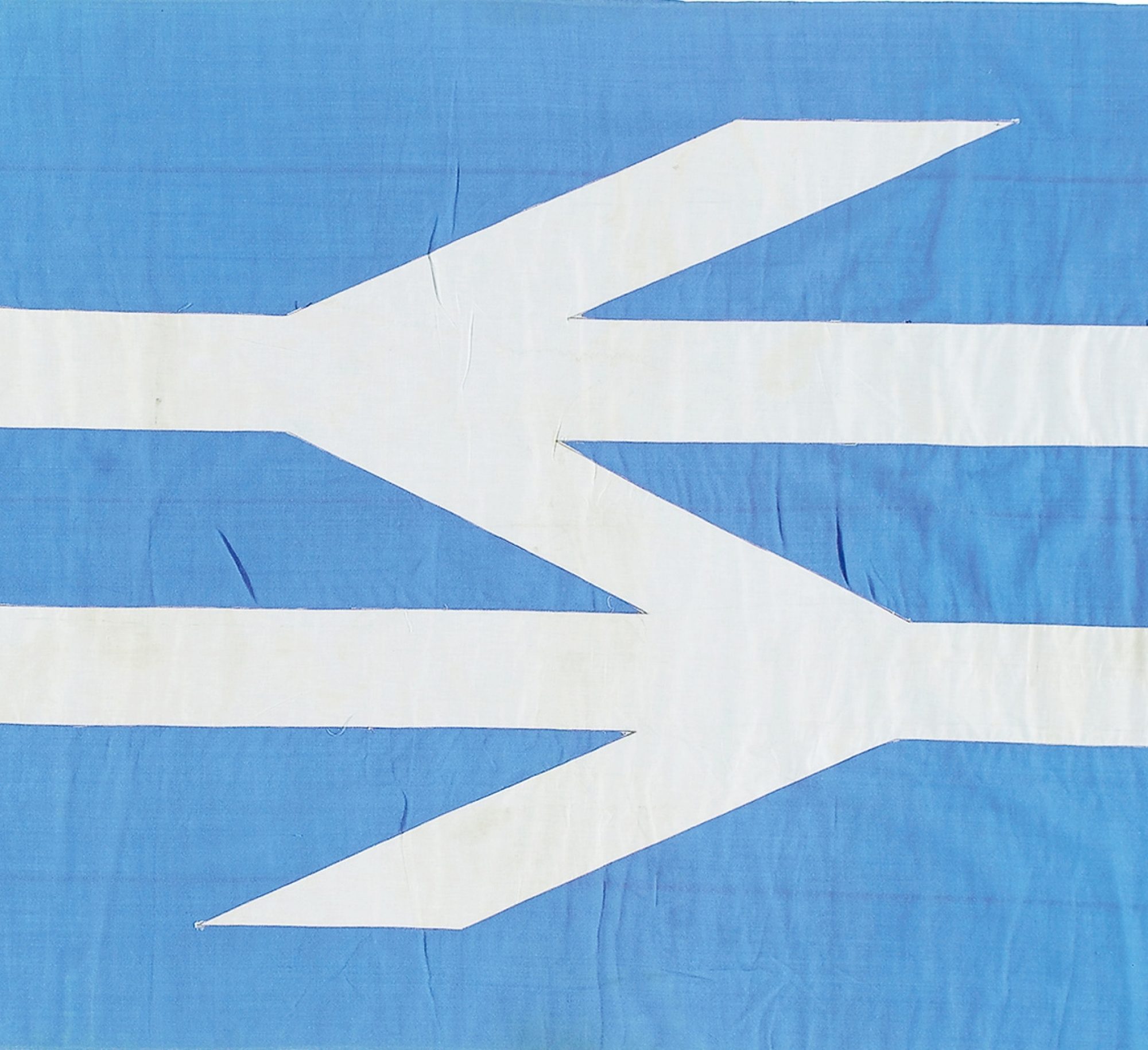
The double arrow symbol? Design Research Unit struggled to find a suitable emblem for the new British Rail brand. As the symbol would be expected to communicate everything about the modernisation of the railways and be ubiquitous across Britain, crafting it was difficult. With pressure from the Ministry of Transport to complete the project, Design Research Unit invited the whole agency staff to help. Gerald ‘Gerry’ Barney (b. 1939) journeyed daily from south west London into the central London offices of Design Research Unit, where he had been a lettering artist since 1960. Looking out from his suburban commute, Barney saw how pairs of railway tracks were connected by shorter diagonal segments called ‘points’ and ‘crossings’. In these momentary glimpses he saw the double arrow: one smart symbol which embodies movement and stability, and is a recognisable but multipurpose brand mark. From some 100 proposals exhibited for British Rail’s Director of Design, Gerald Barney’s double arrow was selected for use.
As a lettering artist Barney was familiar with the nuances of typography, and in particular with the apparent simplicity of sans serif fonts like ‘Helvetica’. The tiniest of adjustments to the parts of a character can make significant differences to its appearance, for better or worse. Any trainspotter or typographer who has tried to recreate the double arrow will realise it is not a simple exercise. This is because the symbol is more than some parallel lines. Here artifice meets modernity: the outer diagonal lines are flared outwards towards their ends to give visual correction, like the bulging entasis of a classical column. Without this flare, the symbol would appear to diminish at its outer ends. Further optical strategies are hidden in the Sealink flag. Because white is brighter than black, the double arrow is drawn with slenderer elements when reproduced in white on a darker ground. To respect maritime tradition, one side of the flag shows the double arrow reversed. This was the only time Design Research Unit permitted such manipulation of the symbol, and how odd it looks.
Gerry Barney moved from Design Research Unit early in 1965 to join the newly formed design practice Wolff Olins. Sealink flew its emblem of post-war British modernity until the business was sold in 1984. The white double arrow on blue ground billowed over modern steel ships in the salt air Irish Sea and the Channel; it snapped in the breezes of Lake Windermere, on the tiny wooden tourist vessels. Now, enthusiasts of Britain’s defunct publicly owned railway organisation long for the return of its monolithic presence, and the forward-looking Network Rail embellishes its new design manuals with the double arrow. The Sealink flag gives us an intriguing version of the outstanding visual metonym for ‘British’ and ‘Rail’, once carried beyond these islands as the ultimate in modernity put to the service of maritime tradition.
David Lawrence associate professor at Kingston University, London, Research Fellow for the London Transport Museum, and design consultant to Network Rail. His books include British Rail Architecture 1948-97 and British Rail Designed 1948-1997.
